Mind Over Moon

Archive for the ‘Artsy Fartsy’ Category

March 12th, 2014 by Moonie

Bushwick Street Art Sightings

Right off the Jefferson St L stop there is a treasure trove of beautiful street art. They punctuate the empty buildings in between the swanky hipster restaurants (farm to fork in these streets). Irony aside, the art was too captivating not to pose in front of; I was overcome with excitement over a potential new Facebook default picture. Anyway, in case you don’t care about how I look in front of graffiti (haters), here’s the art by itself:
September 4th, 2012 by Moonie

Glennz Tees – this guy is a genius

glennz2glennz1glennz3

I’ve been like a mad scientist at my desk for days, trying to bring Frankenstein (my portfolio) to life. I find my productivity exponentially increases if I take half hour breaks every couple of hours. Luckily on my most recent break I found Glenn Jones on dribbble, which led me here. This guy is an incredible illustrator, so buy his t-shirts! That’s right, I linked it twice.

That is all.

August 28th, 2012 by Moonie

Gradient Mesh for Beginners

orangecaterpillar

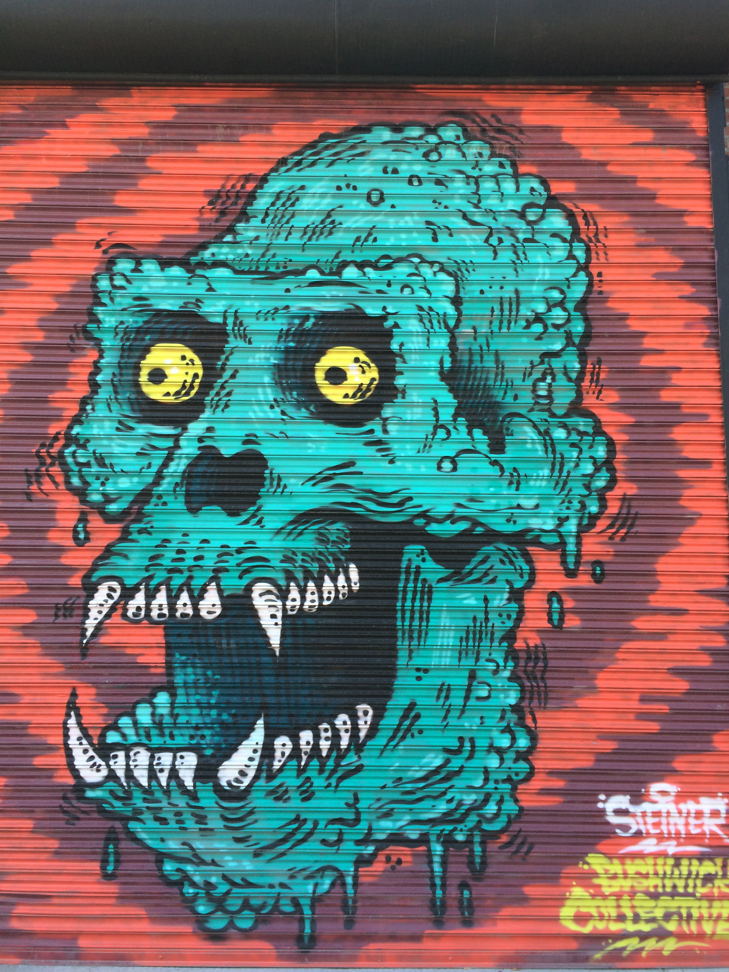
In my Digital Illustration class we have embarked upon a treacherous journey: the gradient mesh. We just handed in our first crack at ’em, and though mine still needs tweaking, I enjoyed the process and am satisfied with my first attempt (above). I would caution that if you want to try this technique, it should really only be attempted after you consider yourself to be at minimum an intermediate skill level in digital design. Prior experience with Illustrator, and specifically the pen tool, will go a long way in making your life easier.
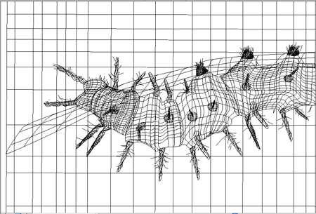
So the first thing we want to do is pick an image, specifically a big one. In my Google Image search I selected larger than 4 megapixels, which is a behemoth. Things that work well for this are shiny: cars, bottles filled with liquid, or, in my case, insects. I picked a rather unattractive fella with a nice color palette:

Orange Caterpillar

After we load our image into Illustrator, set it as a template, dim it, and lock it on the bottom layer. The next part is tricky, but arguably the most important part. Using the (wretched) pen tool, outline the major shapes in your photo.


gradient_mesh

After that, we select the gradient mesh tool and go to work.
The basic idea is to grid out each section, being careful of knotted points from curved lines. It’s good to start with a basic shape, like a square or a circle, add your grid, and then mold the shape to more closely resemble the outlined piece.


orangecater_outline

Using either the eyedropper or color swatches, match and fill the color at each intersection of points. The mesh tool translates each color swatch into a gradient effect with the surrounding colors. And WA-LA! Hours of meticulous color matching later, you have a beautiful, realistic looking image. This is a brief overview, but I recommend taking advantage of the multitude of free tutorials online. Keep in mind a few things:

  • Start with less mesh, and add more later where you think more detail is needed.
  • Don’t pick something with too much texture or color to start: try a ladybug, or a Corona bottle.
  • Always make sure your vector colors are very contrasting to the image colors, so that you can keep track of the nodes better (double click your layer to change the color of the gridlines).
  • Amidst all the tedious color matching, HAVE FUN! Hit Command + Y to check your progress, and re-inspire yourself with the progress of your soon-to-be beautiful creation.

So my next step in this process is to attempt a human portrait, which is a completely different animal (literally). Check out these redonk examples from true masters of the gradient mesh technique.

August 20th, 2012 by Moonie

Hayley Warnham – Ironic Pop Art

Hayley Warnham

The other day I stumbled upon Hayley Warnham, a talented young digital artist. I love the way she injects pop art illustration and color into dated imagery.  I love the ironic futurism and somewhat absurdist visions her work gives me. So apparently she was accepted into The Royal College of Art in London to pursue her Masters in Visual Communication, which, by the way, is A BIG DEAL. The thing is, financially it would be difficult for her to attend. Conveniently she set up a donation fund in case anyone else of copious means is inspired by her art. Looking forward to seeing more from her. It may be quite some time from now, but I’m calling it, Hayley Warnham is the next big thing.


August 18th, 2012 by Moonie

A Celebration of Individuality

Poolside

I’m working on a series of cloning projects inspired by Anthony Goicolea’s “You And What Army”. His work as a digital artist was the first to truly affect me, way back in my very first Photoshop class in high school. I love his injections of humor and his creativity of composition. Shown above is some experimentation I have done with this theme, which I just remembered I still owe my brother some Chipotle for agreeing to model for me.

I recently adopted a new technique with regards to cutting people out. For years I meticulously stewed over Photoshop’s magnetic lasso tool, but often was unable to avoid that “cut out” look. Lately I have been using the quick selection tool:

quick-selection-tool-palette

I like to zoom in and really take my time when defining the area. Once I’m satisfied with my selection, still keeping the marching ants on, I hit “Refine Edge” in order to really sure up my perimeters. It allows for a much more natural look. It comes in handy when attempting to “naturally” place someone into a new environment.

I’ll post more of my clone projects soon. In addition, they are featured in my soon to be released PORTFOLIO! I’m very excited for all the big things coming.

August 15th, 2012 by Moonie

Real Talk: W.C. Edition

IMG_0295_edit2

Found on a bathroom wall at a bar in New Jersey.
It’s the Jersey equivalent of spotting a Banksy.