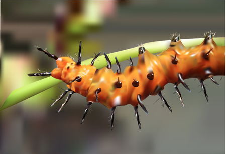
In my Digital Illustration class we have embarked upon a treacherous journey: the gradient mesh. We just handed in our first crack at ’em, and though mine still needs tweaking, I enjoyed the process and am satisfied with my first attempt (above). I would caution that if you want to try this technique, it should really only be attempted after you consider yourself to be at minimum an intermediate skill level in digital design. Prior experience with Illustrator, and specifically the pen tool, will go a long way in making your life easier.
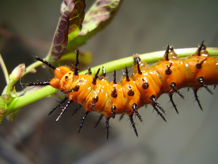
So the first thing we want to do is pick an image, specifically a big one. In my Google Image search I selected larger than 4 megapixels, which is a behemoth. Things that work well for this are shiny: cars, bottles filled with liquid, or, in my case, insects. I picked a rather unattractive fella with a nice color palette:

After we load our image into Illustrator, set it as a template, dim it, and lock it on the bottom layer. The next part is tricky, but arguably the most important part. Using the (wretched) pen tool, outline the major shapes in your photo.

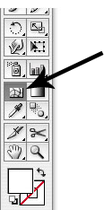
After that, we select the gradient mesh tool and go to work.
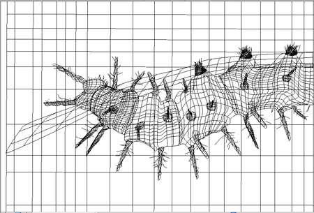
The basic idea is to grid out each section, being careful of knotted points from curved lines. It’s good to start with a basic shape, like a square or a circle, add your grid, and then mold the shape to more closely resemble the outlined piece.

Using either the eyedropper or color swatches, match and fill the color at each intersection of points. The mesh tool translates each color swatch into a gradient effect with the surrounding colors. And WA-LA! Hours of meticulous color matching later, you have a beautiful, realistic looking image. This is a brief overview, but I recommend taking advantage of the multitude of free tutorials online. Keep in mind a few things:
- Start with less mesh, and add more later where you think more detail is needed.
- Don’t pick something with too much texture or color to start: try a ladybug, or a Corona bottle.
- Always make sure your vector colors are very contrasting to the image colors, so that you can keep track of the nodes better (double click your layer to change the color of the gridlines).
- Amidst all the tedious color matching, HAVE FUN! Hit Command + Y to check your progress, and re-inspire yourself with the progress of your soon-to-be beautiful creation.
So my next step in this process is to attempt a human portrait, which is a completely different animal (literally). Check out these redonk examples from true masters of the gradient mesh technique.